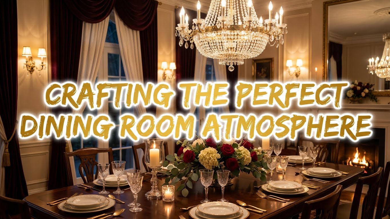
Ever wonder why some dining rooms feel like a warm hug while others have the ambiance of a dentist’s waiting room? Turns out paint chips aren’t just for procrastinating at Home Depot. The colors you slap on those walls are doing some serious psychological heavy lifting every time you sit down to eat.
Colors mess with your head in surprisingly specific ways. Warm tones like reds and oranges actually stimulate your appetite and get people talking. That’s why every Italian restaurant looks like it was painted by someone who really, really loves marinara sauce. Cool shades like blues and greens do the opposite. They promote calmness and relaxation, which is great if your family dinners tend to get a little too animated.
Here’s where it gets interesting. Neutral colors give you a versatile backdrop without committing to anything. You can throw in vibrant accents whenever you feel like it, or when your spouse wins the annual “what should we do with this room” debate. The real question is what kind of vibe you’re going for when everyone sits down. Energy and chaos, or peace and actual chewing between sentences?
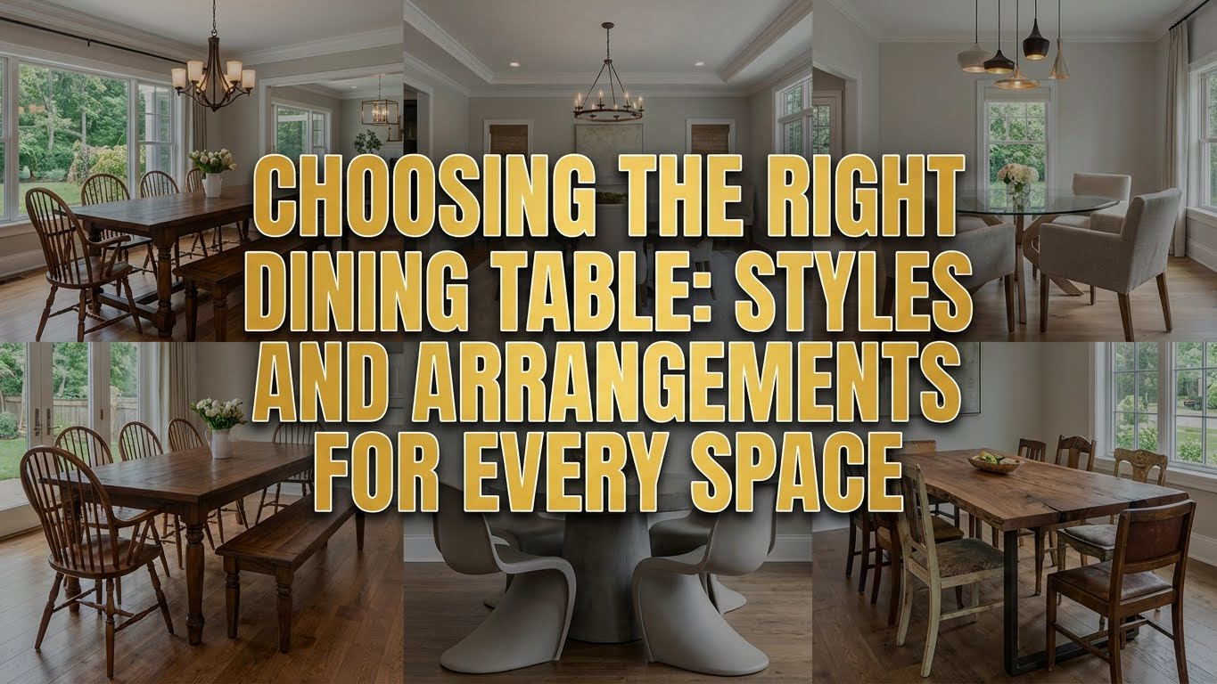
Picking Colors Without Losing Your Mind
Think about the atmosphere you’re trying to create before you buy seventeen paint samples that all look identical. Do you want a lively, energetic space where everyone talks over each other, or a calm, relaxing environment where people might actually hear each other?
Warm hues like terracotta or soft yellows create an inviting feel. Perfect for family gatherings where you need all the help you can get keeping things friendly. Cool tones like soft blues or greens promote tranquility, which comes in handy during those meals where everyone’s pretending last week’s argument never happened.
Accent colors matter too. You can work them in through decor or table settings to add depth without repainting the whole room every time you change your mind. Balance is key here. Consider your room’s size and lighting, because a color that looks sophisticated in the store can look like you let a toddler make decisions once it’s on all four walls.
Warm Colors Make You Hungry, Cool Colors Make You Chill
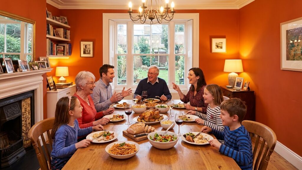
Warm tones like reds and oranges spark energy and conversation. They make your space feel intimate and vibrant, which is ideal for lively family dinners or those holiday meals where everyone’s talking at once anyway. These colors basically tell your brain it’s time to eat, socialize, and maybe have seconds.
Cool colors like blues and greens promote calmness and serenity. They create a relaxed environment that’s perfect for quiet meals or conversations where you actually want to hear what the other person is saying. These hues have a way of lowering the temperature in the room, figuratively speaking.
The emotional impact of colors isn’t some design school nonsense. Warm colors invite energy and warmth, making spaces feel cozy and alive. Cool colors evoke calmness, turning your dining room into a place where people can actually unwind. Choose the palette that matches how you want people to feel when they’re sitting around your table. If you’re not sure, just think about whether your typical dinner needs more excitement or more sedation.
That One Bold Color That Makes Everything Pop
A splash of vibrant color can completely transform a dining room from “we eat here sometimes” to “this is where we gather.” Accent colors elevate the atmosphere and create a space that feels both inviting and interesting to look at. A bold mustard yellow on one wall or rich teal in your accessories adds depth and personality without committing your entire room to a single bold choice.
These accent colors break up the monotony of neutral tones. They draw your eye to specific spots and get people talking about something other than work or the weather. You can use them to highlight architectural features or focal points you actually want people to notice, like that built-in cabinet you spent way too much on.
Whether you go with vibrant chairs, striking artwork, or colorful table settings, these touches breathe life into the room. They encourage warmth and interaction among guests, which is the whole point of having a dining room instead of everyone eating over the sink.
Mixing Patterns and Textures Without Looking Like You Tried Too Hard
Layering textures creates depth and warmth in ways that flat color alone can’t manage. Combine soft fabrics like velvet cushions with sturdy materials like wood or metal to balance comfort with something that won’t fall apart in six months. A plush area rug under the dining table adds coziness and defines the space as “this is where dinner happens, not where we pile mail.”
Woven elements bring in natural charm without making your dining room look like a catalog shoot. Rattan chairs, wicker baskets, whatever works. Mix ceramic plates with linen napkins for a tactile experience that makes guests want to stick around after dessert.
Bold patterns like vibrant florals or geometric shapes serve as striking focal points. They add energy and personality, making the space feel modern and intentional rather than “we just moved in five years ago and never finished decorating.” Subtle designs like delicate stripes or soft, muted colors offer a serene backdrop that promotes relaxation and intimacy.
The trick is balance. Use bold patterns sparingly so they don’t overwhelm everything else you’ve got going on. Let your subtle textures do most of the work, keeping the room warm and welcoming without making people wonder if you lost a bet at the fabric store.
Actually Applying Color Without Regret
Start with a warm palette. Soft yellows or gentle terracotta invite comfort and encourage conversation without screaming at people the second they walk in. Consider an accent wall in deep navy or rich burgundy for depth without overwhelming the space and making it feel like a cave.
Pair bold colors with lighter, neutral tones for balance. This keeps your room feeling airy instead of like you’re eating dinner inside a paint can. Work colorful tableware or vibrant artwork into the mix to add personality without permanent commitment. Textiles like curtains or tablecloths let you introduce seasonal colors, making it easy to refresh the space when you get bored or your current setup stops sparking joy.
Lighting matters more than people think. Warm bulbs enhance color vibrancy and create a cozy atmosphere. Cool bulbs make everything look like a hospital cafeteria, which isn’t the vibe most people are going for at dinnertime.
The Bottom Line on Dining Room Colors
The right colors can transform your dining room into a warm, inviting space where people actually want to spend time. Vibrant hues spark conversation and energy. Soft tones create a relaxed atmosphere where everyone can breathe and enjoy their food without feeling like they’re at a networking event.
The colors you select set the stage for memorable meals and moments you’ll actually remember fondly instead of trying to forget. Mix patterns and textures to add depth and personality, because flat boring walls make for flat boring dinners. Your dining space should reflect the warmth and joy you want to share with the people you invite over, or at least the ones you’re related to and can’t avoid.